Showing posts with label art. Show all posts

Friday, 23 December 2011

The Infernal Dream of Mutt & Jeff - Zoe Beloff @ Site Gallery

Site Gallery, Sheffield, is currently showing an exhibition of Zoe Beloff's work, entitled 'The Infernal Dream of Mutt & Jeff'. Having first encountered Beloff's work through Steve Tomasula's new media novel TOC, I was excited about seeing more of the artist's work.

The exhibition seemed to be divided into three key pieces: an animated film of Mutt and Jeff, the central characters of America's longest-running comic strip (created by Bud Fisher), a triptych film combining two old industrial films from the 1950s and a new film starring Kate Valk (of the Wooster Group NYC) and a contextual commentary which featured cronocyclography. All in all, the exhibition puts forward a complex network of works and ideas. The Mutt & Jeff film clearly evokes a sense of popular culture and of media society.

The triptych film is pretty fascinating. The two 1950s films which it uses are Motion Studies Application and Folie a Deux. Both are instructional: the former designed to achieve uttermost efficiency on the production line and the latter to educate viewers as to how to recognise a particular mental disorder. In itself, the pairing of subject matter is somewhat at odds, and creates a tension of meaning. The new film however complicates the art work further, adding another layer of meaning.

In the new film, Wooster Group actress Kate Valk can be seen 'going through the motions'. Her actions, be they related to product-assembly or mental illness are out of joint, out of time; indeed, they are often slowed down so that they become hyper-real, perhaps exposing the mechanics of a capitalist work force. At other times, Valk's actions move in sync with the participants of Motion Studies Application or Folie a Deux; setting up a further dialectic in the form of an alienation of self.

The Croncyclography in the exhibition was perhaps one of my favourite parts. The exhibition material explained, "Frank and Lilian Gilbreth photographed workers performing a task and wired with a light attached to their finger". Afterwards, the Gilbreth's created sculptures based on the light paths. Beloff's exhibition included photographs of Valk's actions in the film:
The croncyclographs show up productive motion of the body. Moreover, it shows up the relationship between time, motion, and capital. The fiscal value of the productive body is shown up in the photos and sculptures as a real and tangible thing.

Zoe Beloff: The Infernal Dream of Mutt & Jeff is on at Site Gallery until 21st January 2012, and is well worth a visit. You can also read an interview with the artist on ebr.

12 Months of Neon Love

Beginning on Valentine's Day 2011, and set to finish in 2012, Victoria Lucas and Richard William Wheater's collaborative project 12 Months of Neon Love doesn't seem to be a million miles away from Jenny Holzer's work. The project is UK Arts Council funded, and presents romantic song lyrics (1 a month for a year) in red neon on a rooftop in Wakefield.

Heading closer to completion, here's a few the images so far:

Well worth checking out the website!

Postmodernism at the V&A

Back in October, I went to the Victoria & Albert Museum, London to see their latest exhibition Postmodernism: Style and Subversion 1970-1990. I intended, of course, to post about it much sooner, but life got in the way a little...
The exhibition sought to provide an introduction to Postmodernism for the general public, offering an insight into its manifestations in a number of different arts, from art, design, and architecture, to film and fashion. I have to say that I really enjoyed it, but I was disappointed that postmodernist experimentation in the literary arts was almost completely neglected. My visit was rather a long time ago now and so, rather than attempt to review the exhibition, I'm just going to mention two works that seemed particularly powerful and evocative to me.

The exhibition started with the death of Modernism and the uprising of Postmodernism. The museum information stated that while any attempts to date the shift from Modern to Postmodern has been controversial and contested, Architecture critic Charles Jencks points to the demolition of the Pruitt-Igoe housing project (with its embodiment of modernist design in concrete with its simple lines) in St. Louis at 3.32pm on 15 March 1972.

At this point in the exhibition, the work of Italian architect and designer Alessandro Messini was cited. His art work, Destruction of Lassu Chair (1974) seems to perform and embody the rejection of modernism.
A Lassu Chair, simple and and pure in form and design, was set on fire, photographs laying witness to it as a burning sepulchre. The images captured by the photographs embody an attack on modernist design, the end of an era, and the emergence of a new cultural moment.

The second piece that I instantly loved was an image of a light installation by Jenny Holzer (whom I've mentioned previously in relation to the avant-garde art collective Franklin Furnace - see here). The installation in question, quite typical of Holzer's neon and light projection work, was installed on a billboard between 1984-6.
'Protect Me From What I Want' is beautiful in the way it speaks directly to deeper human emotions while simultaneously working with its location and environment to offer a critical commentary on consumerist desire and capitalist economy. I love this.

Anyway, that's enough from me.
There's still time to see the V&A's Postmodernism exhibition - its on until the 15 January 2012. There's also a basic but interesting powerpoint, intended as a teacher's resource for those interested here.

Monday, 10 October 2011

Gomringer at DMU

In September, Eugen Gomringer visited the UK as part of a celebratory tour of his life's work. As such, Gomringer spoke at the Royal Festival Hall in London, De Montfort University (DMU) in Leicester, the University of Derby, and Shandy Hall (home of 18th century author Laurence Sterne) in Yorkshire, amongst a few other places.


Born in 1925, Gomringer occupies an important place in the history of European art and poetry as the founder of the concrete poetry movement. His tour involved readings, talks, and exhibition openings.

The event at DMU exhibited works from the Conz collection, a selection of artworks donated to DMU by Italian art collector and avant-garde publisher Francecsco Conz. The donation, organised by Nicholas Zurbrugg, then Professor of English and Cultural Studies and Director of the Centre for Contemporary Arts at DMU, coincided with Eugen Gomringer's first visit to the University in 1996.

L to R: Francesco Conz, Eugen Gomringer, and Nicholas Zurbrugg

From the early 1970s, Conz began to work with experimental artists, such as key members of the Fluxus movement who were dedicated to exploring art in mixed media forms. Through his publishing company Editions Conz, he also produced large scale ink-on-canvas prints of concrete poetry, among which featured many of Gomringer's concrete poetry creations. Gomringer's works from the Conz donation have been exhibited in the Clephan building at DMU, home to the department of English and Creative Writing, and the Faculty of Art, Design, and Humanities.

The actual exhibition of large canvas prints is impressive. I've obviously seen and read about Gomringer's works in academic books and journal articles, but it really was a different experience to see them for real. There were four pieces which I particularly liked. The first two can be seen below.

L to R:
'memoires, memories, memorias' (1983)
'wind' (1953)

As with all his concrete-poetic works, Gomringer makes use of white space to explore the visual possibilities of the sign. 'wind' is rather self-explanatory, the scattered letters evoking a sense of dynamic motion, the letters themselves looking as though they have been blown by wind. 'memoires, memories, memorias' is somewhat more complicated. Gomringer writes the word 'memories' in French, English, and Spanish, arranging them to form a square, but with one side missing. In his talk, Gomringer mentioned this saying that he had deliberately left this absence, for another language, something else, perhaps beyond the sign.

Another of my favourites was 'kein fehler im system' (1969), shown below, which translates as 'no error in the system'.

The clever thing about 'kein fehler im system' is its playful performance of seeming error, amidst a clearly patterned system. With each repetition of the line, the 'f' from 'fehler' moves one position to the right, thus causing an error in terms of correct language use. However, at the same time, there is clearly a system, a code, which structures this concrete-poem. The code itself is exacted perfectly - there is no error in the system - evolving the text until it arrives full circle at 'kein fehler im system' after its series of permutations.

Finally, I can't not mention Gomringer's most famous piece, 'Silencio' (1954).


Again, Gomringer arranges language so that it performs. Here, the word 'silence' is arranged repeatedly in a rectangular shape. To look at, the block black repetition of 'silencio' appears visually noisy. And yet, in the centre, Gomringer leaves a perfect white space. A blank, which iconically depicts its meaning (and creates a synaesthetic mapping), the visual emptiness metaphorically performing sonic silence.

All in all, the Conz collection at DMU is remarkable. It adorns the walls of the second floor of the Clephan building, outside an undergraduate lecture theatre. Its presence there is understated, subtly imposing, and I do hope those who walk past it take note!

Tuesday, 26 July 2011

Royal Academy Summer Exhibition 2011

I went along to the Royal Academy's Summer Exhibition last week. I'd read a few reviews and seen Alastair's Sooke's entertaining special for BBC's The Culture Show, so I had mixed feelings about what to expect. On the one hand, there are clearly some big names in the show and these figures from the art world seemed to receive the most praise, while much of the public work was seen as rather second rate.

Jeff Koons' Coloring Book in the RA courtyard

I have to say, I actually really enjoyed the exhibition, but it did nevertheless have its highs and lows. Here are some of my favourites...

Michael Vogt
The exhibition opened in Wohl Central Hall which featured photographic works. I was particularly struck with the work of Michael Vogt who had two pieces in the show.

H34 Robert (Left) and H32 Daguerre (Right) by Michael Vogt

Working in contemporary fine art photography, these come from his Heterotopia: In Ruins series, in which the industrial ruins of today are collaged with an image of classical ruins. For me, there is a kind-of temporal jarring, a coexistence of incongruent times and worlds, which in itself holds a strange and haunting beauty.

Another photographic piece that caught my eye was by Royal Academician and previous Turner prize winner Gillian Wearing.


Titled Self Portrait As My Mother Jean Gregory, the image reminds me of Cindy Sherman's work in the sense of assuming other indentities. The photograph comes from a series of six, called Album in which Wearing  transforms herself into the image and pose of family members as taken from an old family album.

Cornelia Parker, herself a Royal Academician, was one of the big names in the show, and one of the highlights. Her work included the photographic Self Portrait With Budget Box as well as the stunning Endless Sugar in which 30 pieces of silver plate had been flattened and hung so that they appeared to levitate above the floor.

The latter was a real stand out, and I don't think any image can do justice to the sense of magic it seems to hold.

In another room, I liked the work of another Royal Academician David Nash whose work Funnel was a hollow Oak, as seen in the gallery image below.


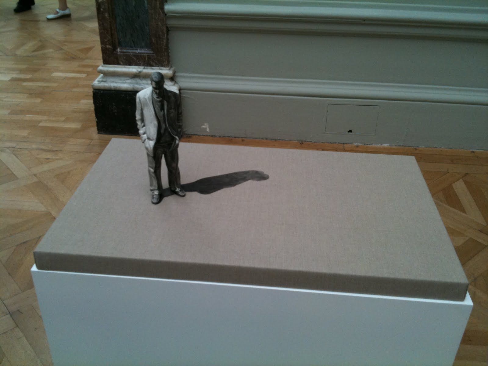
In this same room, was a charming little sculpture by Dae H Kwon of a man casting a shadow. It had the potential, I suppose, to be quite kitsch, but in fact it was simple and beautiful.


The final piece I'd like to mention is a work of collage (surprise suprise - I do love collage). The work is by Simon Leahy-Clark, and called Library II.


The intricacy of the collage was really quite something. Each part, for instance a man's face, is composed of scraps of many faces, and as an overall image it just worked.

The Summer Exhibition 2011 is on at the Royal Academy until 15th August 2011.

Onomatopoeia: The Port - Charles Avery

Onomatopoeia: The Port is the next phase in Charles Avery's Islanders project (launched with The Islanders, discussed here). The Prologue to this second book opens exactly as did the first: " I first came to the Island at the end of the great kelp rush..." Initially, Onomatopoeia's Prologue appears identical, but subtle variations start to arise, until eventually, the narrative becomes wholly original.


As readers, you could start with this book. However, the new additional narrative relies on readers' memory of details from The Islanders in order to unlock some of its narrative intricacies. For instance, towards the end of the Prologue, our narrator Only McFew informs us that as he began to explore the port of Onomatopy on the Island, he "exercised my new status as a tourist by standing in line to purchase a poke of moules and two eggs from Marcel's Casserole". Ordinarily, this is not particularly surprising information. Yet readers of The Islanders are aware of the infamy of the Island's eggs: In The Islanders, we learn that they are branded Henderson's eggs, and are "bitterly disgusting, yet ruinously addictive". The most any one can eat is three apparently, before they are "completely hooked". Indeed, Avery writes, "Many of the prospectors who came to the Island during the kelp rush did not prosper, but instead found ruin in the form of the eggs". Thus, at the end of Onomatopoeia's Prologue, when the narrative ends with the words, "I bit into my second egg", those readers who know of the eggs' power interpret the sense of foreboding these words contain, and the slippery downfall for Only McFew at which they hint...

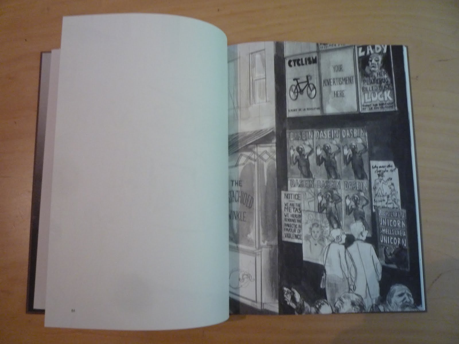
After the Prologue, Onomatopoeia really consists of Avery's stunning illustrations. It opens with a reproduction of Avery's large scale drawing of the port of Onomatopoeia (which featured in British Art Show 7, discussed on this blog here).


Since the original image is so large, the subsequent illustrations are essentially close-ups of areas of this initial picture, allowing the reader/viewer to really admire the detail of Avery's drawings.


Finally, echoing the structure of The Islanders, Onomatopoeia concludes with an Epilogue. As the final words of the Prologue implied, all is not rosey for Only McFew who states that he is "profoundly lost". He tries to write an inventory to keep his mind sharp, detailing the contents of his bag as well as "Self: I am called Only McFew (really!)" - Incidentally, this is troubling since this is the name Miss Miss understood, and seems unlikely to be the narrator's real name. In itself, this raises all sorts of questions for the reader concerning Only McFew's state of mind and well-being.

Enigmatically, the Epilogue to Onomatopoeia ends, "And finally I have started to wonder if, beyond the shops and bars and lights of Onomatopy, beyond the Plane of the Gods, where the defunct machines and litter are strewn, underneath the mountains and the flowers and the dust and the bones of the hunters, there is an island at all?"

Monday, 18 July 2011

The Islanders: An Introduction - Charles Avery

"I first came to the Island at the end of the great kelp rush, although I was not aware of that at the time. On the contrary, I had sought out this strange land with a view to being its discoverer."

So begins Charles Avery's The Islanders: An Introduction. The Islanders is, on one hand, a book, a fictional travelogue which catalogues a place called 'The Island' as encountered by the book's narrator. On the other, it is the first part of Avery's lifetime project, documenting the first four years of the Scottish artist's magnum opus.


The project itself is composed of large scale drawings, maps, sculpture, taxidermic specimens, and even a 3-D computer generated model of the Island (though Avery sees the latter "as a tool for me to use", rather than an artwork in itself). The objects and artifacts of The Islanders can be seen in gallery exhibitions such as the 2009 Tate Triennial Altermodern or the more recent British Art Show 7: In the Days of the Comet (reviewed on this blog here). And of course, they are documented in this book.

But The Islanders is more than an exhibition catalogue or archive of the artist's work: It is a fictional world of Avery's imagination, an altermodern archipelago, a new and unknown territory.


Having found the Island, the narrator prepares to leave, untying his boat, but is startled by a strange noise. Coming towards him is a beguiling young woman with whom he falls in love. The prologue concludes, "Through a series of misunderstandings, I came to believe her name was Miss Miss, and she, that I was called Only McFew. Miss Miss was to become my close companion and sponsor on the Island - although she consistently and firmly resisted any further advances. I remain to this day her devoted admirer."

Staying on the Island, perhaps because of love, perhaps because of curiousity and a calling to hunt and explore, Only McFew becomes familiar with the Island's inhabitants and its myths, as documented in the book. As readers, we learn about the various parts of the island such as the Avenue of the Gods, a lively market or bazaar; we're told of the prestigious role of the Hunter in Island society; we're introduced to the Island's peculiar (and strangely real) Gods; and we hear legends about its uncanny and surreal creatures.


In many ways, The Islanders is a conceptual exercise. It's about creating something and somewhere, it's about representation, its boundaries and its limitlessness. Even so, the book is strangely absorbing, and this is down to the detailed execution of Avery's drawings. They are undeniably masterful; the expressions on the faces of the Island's inhabitants, the Island and it's people's otherly familiarity...


...It's quite simply compelling... and intriguing. I am genuinely curious about what Avery will think up next for this imagined realm.

Interestingly, Avery seems to predict this. In an episode about the hunting and killing of an Aleph (a creature of the Island), Avery offers the following illustration:


The illustration depicts two 'Triangleland Bourgeoisie studying the head of an Aleph'. 'Triangleland' is the name for the other world - reality, in other words. Implicitly, then, there is an art gallery context being inscribed here, as though Avery is implying our own complicity in the project, the fact that the Island, however fictional, is something we lay witness to in his exhibitions.

The project continues with Onomatopoeia: The Port (which I subsequently blog about here), but in the meantime, Avery concludes The Islanders with a tantalising direct address: "I cannot tell you how this world really is - I have no idea - I can state only the facts as I perceive them. You must be satisfied with this or you must travel there yourself sometime, and see these beings in their natural environment, for this place is utterly subjective".

Saturday, 9 July 2011

The Island of Misfit Toys

On Thursday 8th July 2011, I went to the opening of 'The Island of Misfit Toys' at APG works in Sheffield. The exhibition showcases works by Parisian artists EMA and ANACAO. The opening itself was buzzing, but the art itself was certainly the highlight.


Spread across two rooms, EMA and ANACAO's work collectively sought to represent, in APG's words, "a gloomy universe populated by vintage, romantic, and strange toys inspired by Japanese pop animation, 70's science fiction and graffiti". Indeed, the work (which the photos taken on my iPhone really don't do justice!) has a surreal, almost psychedelic feel, with each artists distinctive style complementing the other.


The image above shows work by ANACAO (left) and EMA (right) respectively.


The exhibition features a new series of oil paintings, drawings, and screen prints, as well as the installation shown above. It runs until the end of July 2011, so if you're in Sheffield get to it!

Sunday, 12 June 2011

Ulrike and Eamon: Compliant

It's Friday afternoon, and walking around the city of Sheffield, I stumble across an inimitable wooden box or room. There are air holes drilled into it and clipboards hanging on the side.


Curious, I approach and examine the clipboards. There are two, each of which gives a brief biography of a militant terrorist:


I am intrigued so, perhaps against my better judgement, I enter the box-room.

Inside, there is a screen on the wall showing a woman being interviewed, or perhaps interrogated. On the wall in front of me is a shelf with a mobile phone and some instructions. I follow the instructions: I pick up the phone and press the green dial button twice. It has started.

A voice on the phone asks me whether I am Ulrike or Eamon. I comply and dial 1: I am Ulrike. The voice then asks me to leave the box, telling me which direction in which to walk. I am going towards an empty office building. When I get there, I must face the doors of the office and call him back. I comply.


"Hello Ulrike, thanks for calling me back". The voice speaks directly to me. He asks me about myself: "Are you a hesitant of decisive person?" After the beep I respond "My name is Ulrike. I am a decisive person". I stand with my back to the world, looking inside the desolate office space. I feel at once absorbed in an intimate conversation with the enigmatic voice on the phone but self-conscious; back to the world I am unaware of what is happening and it makes me feel strangely vulnerable.

I move off, following the directions of the voice, but he advises "Keep your eyes open. Act natural." Between directions, the voice tells me about my life. The choices I have made. How he admires my courageousness. How I once said that to set fire to one car is a crime, but to set fire to 100 is political. How I choose to place my children in an orphanage, and how it made him wonder why I would have done so.

I am asked to make a decision. Do I want to continue walking down this street: If so stay on the line. Otherwise hang up. I comply and stay on the line. I'm involved now. I walk towards a sheltered spot, under a tree. The voice says "Pick a person on the street. Look at them. Think about their home. Think about who they love." I comply. Doing so, the way I feel about this person is hard to describe: One of the things I feel for them is a strange sadness as they walk passed me in the rain, unaware of how they absorb my thoughts.

I move off and continue on my journey. The voice directs me down a deserted alleyway.


When I reach the bottom, he asks me if I'd like to see this thing through. Am I prepared to face the questions? Or am I the type of person to run and hide? I've come this far - I stay on the line, and the voice says "Ok Ulrike, I understand, You're prepared to face the questions". I am led to a meeting point. I nod as instructed at the 'contact' and I am led to another wooden box-room.

There are two chairs, and a mirror on the wall. A man tells me to take a seat and sits down opposite me. I hadn't expected this. I don't feel prepared. But I comply.

"What would you fight for?" His eyes fix me in place.
"Personal Freedom", I mutter nervously.
"Against all odds?" "Where do you draw the line?" "What are you prepared to do for this? Could you kill in the name of personal freedom?"

It is intense. An interrogation. Finally he asks me, "Are you a hesitant or a decisive person?"
"I am Ulrike. I am a decisive person."

"Thank you" he says, and leads me out of a door on the other side of the room. He walks me around the box to a window. "Wait here" he says and leaves me. I look through the window, I realise the mirror in the box-room was a two-way mirror. Somebody was watching everything I said.


Horrified, I stand there looking in as a woman is led into the room. She sits, as I did, and the interviewer starts again:

"What would you fight for?"


('Ulrike and Eamon: Compliant' is the creation of Blast Theory, and first presented at the Venice Biennial. I saw it in Sheffield, UK as part of the Sheffield Doc/Fest)

Friday, 10 June 2011

LIES Inc.


You know an exhibition is going to be out of the ordinary when, on entry, you're greeted by a disclaimer: "Please be warned -  you enter at your own risk". There's been a lot of buzz surrounding Site Gallery's newest exhibition 'LIES Inc.', a retrospective of the work of Eva and Franco Mattes (its been touted in The Guardian and BBC). These are notoriously playful artists - 'pranksters' the BBC calls them who in The Guardian's words will be up to "some kind of no good". Controversy and intrigue are words that come to mind. Afterall, the two are known for stealing, with the help of distraction and a Swiss army knife, fragments from famous artworks by the likes of Warhol, Kadinsky, and Beuys.

The Sheffield exhibition opens with the pair's signature Catt, a sculpture which features a cat in a birdcage that Eva and Franco Mattes duped the art world with by passing it off as a work by Maurizio Cattelan. The most facinating piece exhibited in Site Gallery was, for me, a work called No Fun. No Fun exploits a live-webcam software tool called Chatroulette in which users 'gamble' by accessing and communicating with other Chatroulette users at random. When the unwitting participants click 'Next' and reach the live-feed from the camera Eva and Franco Mattes have set up, the image which greets them is that of an uncomfortably real-looking (but of course, staged) suicide. In No Fun, we can see both live feeds, the fake suicide and the different user's reactions.


I was mesmerised by No Fun, watching and listening to the other user's reactions for some time. The experience is really unsettling, not least because it exposes the immoral side to human nature (In the time I watched it, only 1 person called 911; some didn't take it seriously but most of those who did quickly disconnected, keen to alleviate themselves from the situation and any form of moral responsibility).

The other thing at 'LIES Inc.' that really got me was a new work, Plan C and the ominously named The Liquidator, described by site as a "sculptural merry-go-round". At the end of the Gallery exhbition, we saw a short film called Let Them Believe which documents the development of Plan C. In doing so, it depicts the creation of Plan C as an undercover research trip to Chernobyl, torn and shattered as it is by the 1986 nuclear disaster. According to the film, the merry-go-round was part of an amusement park being built, and was opened early so that it could be enjoyed before the world seemingly ended. Plan C itself was the recovery of a merry-go-round from the site, housed for a few short days at a secret Sheffield location as The Liquidator, the merry-go-round now regenerated or at least cobbled together from materials taken from the Chernobyl site 25 years on. And the materials themselves still hold/emit low-level radioactive charge.

To go on the merry-go-round, we had to sign a disclaimer (!) and were asked to wear Hazmat suits for protection from the radiation. Below you can see Alice, Sarah, Rob, and I all kitted up!


The ride itself was actually really fun. Who doesn't like a merry-go-round? And its location in a disused Sheffield factory by the river was beautiful - street art by Kid Acne and Emarama.


At the end of the ride, we were measured for radiation, as was the ride, with the count continuing to rise.


Plan C and The Liquidator are brilliant works of art, and so unnerving. There's something really perverse about enjoying yourself and having fun on a merry-go-round which signifies tragedy. However, with Eva and Franco Mattes' reputation, can they be trusted? Is The Liquidator really what it claims to be? Or is it another elaborate hoax, with the Let Them Believe film serving to authenticate it? Whichever it is (and I think walking the line between the two is in itself fascinating), it works to expose to us the triviality of artfans contemplating how such a work of art made them feel in the context of the horror and tragedy of Chernobyl, itself with timely parallels to recent events in Japan.

Despite, or perhaps fundamental to, the duplicitous nature of their art, Eva and Franco Mattes certainly have a serious message, and one that asks us to confront who and what we are.


(Pictures come from my iPhone and the kindness of Alison Geldart who has a very interesting blog about words here)

Tuesday, 8 March 2011

John Stezaker

I also went to see the three-decade retrospective of another important British artist, John Stezaker, at White Chapel Gallery. I've known this for some time, but now it's definitely official - I love collage! So, as you've probably guessed, Stezaker's work is an art of collage and appropriation, of putting unlikely images together and in doing so creating something new.

Some of my favourite pieces are the ones that seem to create metaphors from the collage assembly. This seems to be the case in both 'Sonata' (2009) and 'Bridge' (2007), for instance, both shown below.


While 'Bridge' is suggestive of the relationship between the depicted father and son, 'Sonata' reflects what we might think of as a dreamscape, perhaps conjured up for the female pianist by the beauty of the music she plays.

I also really loved the 'Mask' and 'Pair' series' which transpose landcapes onto faces in beautiful and haunting ways.

Not only do these collages show up the sophistication of the human perceptual system (in that perceive continuities between the human figures and their facial landscapes), they also show up the way in which we as viewers seek meaning. Somehow and for some reason, these surreal images till conjure an affective response.

One last mention is the (2006) 'Love' images:


The simple act of overlaying the eye area of the same image gives the impression of enhanced attraction, of sensual stimulation.

Ultimately, I can't talk about everything - I would if I could as I was so overwhelmed and excited and intrigued by all the pieces in the exhibition - and I have to say that the images shown here don't do justice to seeing them for real.


Monday, 7 March 2011

British Art Show 7


The British Art Show is organised every 5 years by Hayward Touring and showcases leading and emerging British artists. British Art Show 7: In the Days of the Comet (BAS7) is on at the Hayward Gallery at the moment, and so I took myself down there on Friday as a treat.

BAS7 featured 39 Artists exploring themes of history, temporal continuity, and parallel worlds. Overall, I found the exhibition invigorating. As is always the case, there were highs and lows in the collection for me. I'm going to use this blog to mention some of the stand-outs.


Christian Marclay - The Clock (Video) was one of the reasons I went to the exhibition in the first place. I was so excited about it, and it did not disappoint.


The Clock is a 24hr video that is composed of found video clips from countless films; each flim-clip or fragment features a reference (visual or verbal) to time. What's really cool about this work though is that as we watch these clips, narrating a disjointed story of sorts, the film-time unfolds in real time. As a viewer, you are both intensely involved in the bizarre story of the screen while being hyper-aware of how long you have been watching the piece. Your attention is somehow strangely split or perhaps it oscillates between the fictional and the real. I also really liked the fact that the film seemed to be littered with meta-comments about time.
I started watching The Clock at 12.10. It was hard to drag myself away.


Elizabeth Price - User Group Disco (Video) was the other video piece that I was really engaged by.


Set in a "fictional institution", this piece explores parallel worlds, while merging worlds through a clash of visual, verbal, and sonic register: images of kitsh porcelain and metallic utensils, corporate ppt text, and the music of A-ha (Take on Me). What I thought was really fascinating about User Group Disco was the way that it seemed to gather momentum, exposing the ideology of the corporate discourse and casting it in an unsettling light.


Charles Avery - The Islanders; Onomatopoeia also explored parallel worlds, this time a parallel world of the artist's own creation. And on a epic scale: The world of Onomatopoeia is a four-year project for the artist. The project features large scale pencil drawings, sculptures and installations. On display at BAS7 was an installation and a sculpture. It was the drawing that caught my eye.


I've seen Avery's work before at the Tate Triennial on Altermodernism, but this was the first time I'd seen his drawing. Its sheer size and detail really work to bring the world alive, and the comical yet grotesque figures who populate this world disturb and thrill the viewer in equal measure.


David Noonan - Untitled (Tapestry is the final work I'd like to mention here. Another large-scale item, Noonan's piece is a monochrome tapestry which collages images by overlaying or superimposing them.


The effect is both beautiful and haunting. The images and the worlds they represent are somehow coexistent, blending different periods and cultures within the space of a solitary tableau.


Ultimately (as you can probably tell), I loved British Art Show 7. Ironically given the theme, and felt particularly while watching The Clock, I wanted more time there!